• New Horizons on Maelstrom
    Maelstrom New Horizons


    Visit our website www.piratehorizons.com to quickly find download links for the newest versions of our New Horizons mods Beyond New Horizons and Maelstrom New Horizons!

Released Frigate "Rossiya", 1728

I have encountered the Rossiya both at sea (part of a French squadron attacking the bastion at Caracas) and just today in the Shipwright's inventory during my continuing testing for GOF Eras mod. :D Yeay!!! Here's some screens. MK
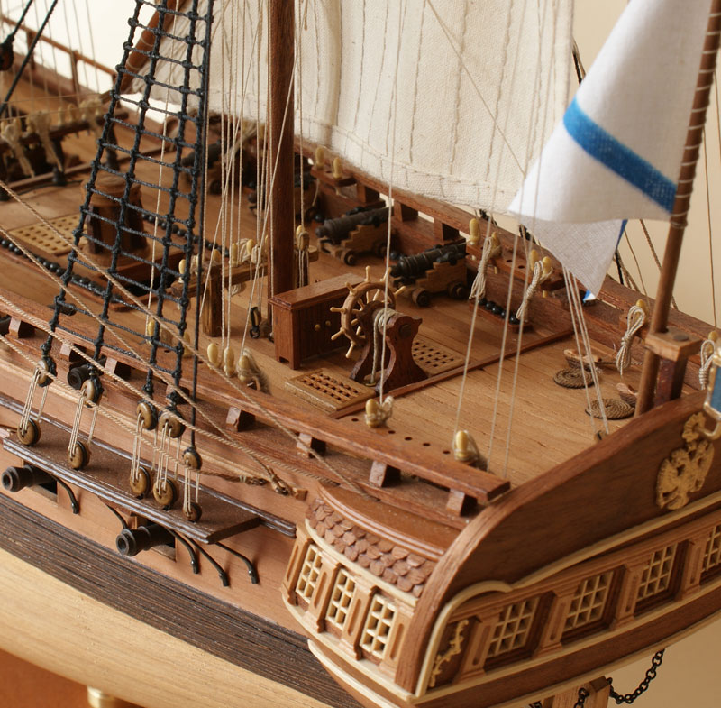
start_130118_0310541.JPG
start_130129_1226220.JPG
 
Cool! It's nice to see the ship properly integrated into GOF.
I like the description you gave her, as well. You may want to eventually replace the ship's interface pictures with ones taken from within GOF, for the sake of consistency.

One other thing, have you been able to try the improved sailorspoints file from this post? http://www.piratesahoy.net/threads/frigate-rossiya-1728.18305/page-24#post-443424
I found a couple of errors that might have been affecting the performance, but based on Takeda-One's comments, I'm not sure if it's an improvement.
 
That one seems to have been launched in 1754, so is more modern than the frigate I recreated (launched in 1728).
Nice model, though.
 
Hmm, really. How could I miss it? As far as I remember, it was a common practice to inherit glorious ships' names.
 
I've recently been testing Maya on my new laptop to ensure it runs properly, and decided to have another go at rendering this ship, to try and improve the lighting effects.
I haven't yet adjusted the sails to Post Captain's suggestions, but I have changed to the Mental Ray renderer to produce a much better sun and sky simulation.
The main improvement is softer, more natural shadows. See what you think:

Rossiya_hires_render7.jpeg


Rossiya_hires_render8.jpeg
 
The shadows themselves look ok, but overall the picture looks too bright and washed out to me.
 
That's probably because the light intensity is too high. Haven't found the right settings to change that yet.

Anyway, here's how it looks below deck:
Rossiya_hires_render9.jpeg
 
Drool. I am there.

BTW, I tried to capture the Rossiya yesterday but just could not do it. Have not seen her in any shipyards yet.
 
Beautiful! I think one of the outside shots would be great for a moddb banner with a Hearts of Oak Logo in the corner
 
Using one as a banner might be nice, though I should probably adjust the sails and lighting first.

Actually, that brings up a good question: rather than have the wind coming from behind and furling all the stays'ls, could we get a more 'artistic' sail layout from wind coming from another direction?
 
A beam reach would be suitable. That way, you can have everything set. (Wind coming from 90 degrees) The yards should be braced hard up (as far around as you can get them. Go until they start fouling the shrouds, than go five more degrees to account for the shrouds being pushed out of the way) The mizzen sail should be braced in the same direction, but only about 15 degrees off center. The rest of the fore and aft sails should be sheeted about 15 degrees off center as well, in the same direction.

The sprits'l and sprit tops'l should be canted over like so:
images

You might want to check the reference videos thread for some examples. The Brig Pilgrim Under Sail videos I took will be useful. If I remember correctly, we were close-hulled there, but the sails were set in a way that was also suitable for a beam reach.
 
That sounds ideal. Should be fairly easy to align the yards and sails correctly, so I'll try to get a draft render done later.
 
As promised, here is a new render portraying the conditions described above:

Rossiya_hires_render10.jpeg
I managed to turn all the squares'ls by 30 degrees, which seems to look about right. I also replaced the Russian placeholder flags with British ones, since Russia won't appear as a faction in the first version of Hearts of Oak.
You'll notice the image was taken from the other side of the ship, which aside from capturing the shape of the sails nicely, also shows the side of the ship facing away from the sun, to reduce the 'whitewash' effect from before.

I reckon it's a marked improvement on the previous renders; it almost reminds me of a Geoff Hunt painting.
What does everyone else think?
 
I like it! only thing is most of the ensign looks white when it appears to actually be a blue ensign. Might be something to do with the lighting?
 
It's the blue ensign from PotC, but I think it's the sail next to it that makes it appear white, because the shadow-covered white looks similar to the navy blue exposed to the sunlight.
So yes, it's just trickery of the light. Shouldn't be much of a problem, though.
 
Just to see how it looks, I made a test banner for ModDB:

ModDB_Banner.jpeg


Because of the image proportions required, I had to leave out the ensign (which is probably a good thing, meaning the image isn't biased towards any nations :p).
I also upped the contrast very slightly, for the sake of artistic effect. Any thoughts?

I'll probably post the original render (or any improved versions) in the Images section, so people can see the entire concept.
 
The squares should be braced to at least 45 degrees. Besides that, looks good.

Edit: Sprits'ls should be sheeted closer to horizontal than vertical.
 
Back
Top