About those checkmarks: Could the colors used for the boxes be changed to give more contrast between used and not used? I have a hard time telling which is which.
-


Visit our website www.piratehorizons.com to quickly find download links for the newest versions of our New Horizons mods Beyond New Horizons and Maelstrom New Horizons!-
Join our discord server for regular podcasts/AMA about upcoming and released pirate games (Caribbean Legend, Corsairs Legacy, Ahoy, ERAS 2, etc.):

-

Quick links for Beyond New Horizons
- Download latest version
- Wiki - FAQ - Report bugs here - Bug Tracker on Github -

Quick links for Maelstrom
- Download the latest version of Maelstrom
- Download the latest version of ERAS II - Download the latest version of New Horizons on Maelstrom
-
Join PiratesAhoy! on our social channels:


-

Quick links for PotC: New Horizons
- Download latest version
- Wiki - FAQ - Report bugs here
-

Thanks to YOUR votes, GOG.com now sells:
- Sea Dogs - Sea Dogs: Caribbean Tales
- Sea Dogs: City of Abandoned Ships
Vote now to add Pirates of the Caribbean to the list! -

Quick links for AoP2: Gentlemen of Fortune 2
- Downloads and info
- ModDB Profile
- Forums Archive -

A Pirate Podcast with Interviews
Music, Comedy and all things Pirate!
- Episode Guide - About - Subscribe -
- Twitter - Facebook - iTunes - Android -
- Youtube - Fill the Coffers -
You are using an out of date browser. It may not display this or other websites correctly.
You should upgrade or use an alternative browser.Included in Build Better contrast between active and inactive perks
- Thread starter Hylie Pistof
- Start date
 Do we still need to do anything for this one?
 Fine then.
 I was expecting to do it myself anyway.
I was about to say "this shouldn't take long", but then I found the folder containing all the perk textures with locks on. Was that really the best way to add a lock icon? Yes that was the best way to do it.
It still shouldn't take that long.
Just convert all 64disabled to tga files. make a transparent layer with the lock image on it.
Paste it on all tga files
save them again and convert them back to the forbidden folder.
If you can overlay a tick mark on acquired perks, why couldn't the same be done with a separate lock icon for locked perks?
Failing that, why not just use a generic "locked perk" icon in place of the regular perk icons?
Sorry for questioning this; I just want to make sure there's no better alternative before I go ahead and edit a folder full of images. Because this way the locked icon can also be shown in the pop up screen for required perks etc so you can see which ones are locked but required.
There is a possebility to have an overlay, but it required multiple changes to the interface ini and I need to test it in both the brown and blue interfaces etc. while this was so much easier to do.
I don't know which programs you use but I used paintshop pro and was able to just do the command on the whole folder. this can be done with photoshop also as far as I know.
I first had a generic locked perk icon but people complained that was weird and confusing.
Ah, I see.Because this way the locked icon can also be shown in the pop up screen for required perks etc so you can see which ones are locked but required.
There is a possebility to have an overlay, but it required multiple changes to the interface ini and I need to test it in both the brown and blue interfaces etc. while this was so much easier to do.
Fair enough, at least you tried that.I first had a generic locked perk icon but people complained that was weird and confusing.
@Hylie Pistof: For your original question: would a different coloured tick mark help? Or are you saying the borders around the perk images are confusing because they're similar? If the borderline for disabled/forbidden was grey it would help.
Maybe the padlock not in color?
If the Perkname could be different somehow it would be even better.
The "cost" number to the right - can it be removed when you already have got the perk?
The last thing sounds like an idea, need to look into the code how easy it is to remove the cost number, but I think it can be done quite easy.
I was also thinking about adding something after the text when contributed or obtained
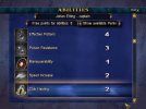
I've just finished changing the lock icon for all the perks. See below for an example, and attached for the TX files.
I found a plugin for GIMP which allowed me to add the lock as a 'watermark' to all the images at once.
I've also uploaded the lock icon itself with a transparent background, in case anyone wants/needs it for other purposes (or new perks).

Attachments
Compiled them all in here and added the sugestion of having the cost dissapair when you obtained the perk.
Please test:
http://www.piratesahoy.net/threads/levis-stuff-v-4-0.25316/
@Hylie Pistof do you think it's clear enough now or should more be done? -