
-


Visit our website www.piratehorizons.com to quickly find download links for the newest versions of our New Horizons mods Beyond New Horizons and Maelstrom New Horizons!-
Join our discord server for regular podcasts/AMA about upcoming and released pirate games (Caribbean Legend, Corsairs Legacy, Ahoy, ERAS 2, etc.):

-
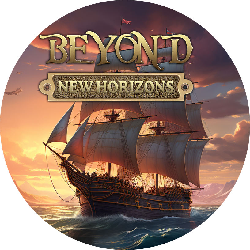
Quick links for Beyond New Horizons
- Download latest version
- Wiki - FAQ - Report bugs here - Bug Tracker on Github -

Quick links for Maelstrom
- Download the latest version of Maelstrom
- Download the latest version of ERAS II - Download the latest version of New Horizons on Maelstrom
-
Join PiratesAhoy! on our social channels:


-
Quick links for PotC: New Horizons
- Download latest version
- Wiki - FAQ - Report bugs here
-

Thanks to YOUR votes, GOG.com now sells:
- Sea Dogs - Sea Dogs: Caribbean Tales
- Sea Dogs: City of Abandoned Ships
Vote now to add Pirates of the Caribbean to the list! -
Quick links for AoP2: Gentlemen of Fortune 2
- Downloads and info
- ModDB Profile
- Forums Archive -

A Pirate Podcast with Interviews
Music, Comedy and all things Pirate!
- Episode Guide - About - Subscribe -
- Twitter - Facebook - iTunes - Android -
- Youtube - Fill the Coffers -
You are using an out of date browser. It may not display this or other websites correctly.
You should upgrade or use an alternative browser.So this is Xenforo
- Thread starter Keith
- Start date

Seconded. That looks the most like the old forum, I'd say.I agree mate, xenFracture Light looks pretty good.
I like the current Aurora theme, but I'm not sure the red really works compared to the blue we've been used to for so long.
Plus, it doesn't use the entire width of the screen, which is a minor downside.
On another note, it's nice to see some of the good ol' smilies back!

 I agree mate, xenFracture Light looks pretty good.
I can't decide if I like Xenfracture Light or Aurora best.Seconded. That looks the most like the old forum, I'd say.
I like the current Aurora theme, but I'm not sure the red really works compared to the blue we've been used to for so long.
Plus, it doesn't use the entire width of the screen, which is a minor downside.
On another note, it's nice to see some of the good ol' smilies back!
As for the color, maybe "Aurora Blue" would be more fitting: http://xfdev.akrion.net/index.php?misc/style&style_id=5&_xfToken=1,1322955397,895067827eb1ea9fff1b19b484f090a3a486974d&redirect=/index.php - I don't know if the blue is too light and thus takes us back to the "too bright" problem.
As for the width, I propose to use the "Aurora Fluid" style, such as the one I linked to, which uses the entire screen width.")
Yeah, that's nice. Although I don't use smileys very often. I guess all the other ones will be added later. Well, I'd like to leave the Aurora as it is now as the default, but I'll add the fluid and the blue to the choices.
Update: Both A-Blues are instaled aswell as the basic fluid version. After having a look at the blue I think we'll make that as the default, looks much better. I'll keep the fixed as default as it's easier to navigate for the newbies but the fluid version is available in the user preferences.
Good find
Update2: Added German and French to the language choices. (UK English soon hopefully, you know real english") )
)
Stallion, no it's something I've thought for some time, IPB is bloated. We're still on Hostgator but Xenforo apparently uses alot better programming and IPB and VB as they are using alot of legacy code where Xenforo was only made from ground up quite recently. (Or so they say)
Nice. Sounds good.
There are other colors as well, but for Pirates Ahoy! the blue one is probably most fitting: http://akrion.net/2011/12/xenforo-theme-aurora-ver-1-1-0-0/
Thanks! I now need to log in as "Grey Roger" rather than my real name, but it kept my password.Grey, no worries all done, you may need to relogin.
Thanks Keith, nice to have the extra theme choices.
LOL! That will be a nice touch.(UK English soon hopefully, you know real english )
 I'm not too happy about the post dates, both in location and visibility. I have a hard time seeing them and sometimes find meself reading very old posts.
The first bookmark I made for this new site has died. I had to do a search to find this place again and make a new bookmark. Perhaps others have this problem also.
Yeah, in hindsight changing it to xen.piratesahoy.net for a test was not a great idea.
I'm not too happy about the post dates, both in location and visibility. I have a hard time seeing them and sometimes find meself reading very old posts.
The first bookmark I made for this new site has died. I had to do a search to find this place again and make a new bookmark. Perhaps others have this problem also.
Yeah, in hindsight changing it to xen.piratesahoy.net for a test was not a great idea.
I'm going to have to accept that everything (including google) will have to refind us. That will take a couple of months i reckon to get back 100%.
With the post dates, I'll see if I can change the .css to make it a bit easier to see.
I'm not too happy about the post dates, both in location and visibility.
I also think their location and visibility isn't very good, so it would be nice if it could be improved.With the post dates, I'll see if I can change the .css to make it a bit easier to see.
The things posted here are also related: http://www.piratesahoy.net/threads/how-am-i-supposed-to-track-topics-anymore.18730/#post-422484
I've been wondering recently what to do about the User Groups we have and how to make them more obvious on the forum.
Back with IPB, it was very clear who was a Moderator, Modder, News Gatherer etc, but with Xen that only shows up if you don't use a custom member title, and without the distinctive colours.
A simple solution would be to disable custom titles, but we don't really want to remove that freedom, do we?
So I had a quick look for an add-on that could do something similar, and found something that looks promising: http://xenforo.com/community/resources/rt-user-rank-ribbons.832/
Further down that page is demo of some 'ribbons' you can use to show which group(s) a user belongs to, and it's very customisable.
Anyone else think this would be good to have? We'd have to ask Keith nicely, of course...
While I'm at it, does anyone else want a 'post count' back for each member, or a ranking system like we used to have (e.g. Landlubber, Sailor Apprentice etc) for regular members?one cannot promptly comment on Recent Status Update (sans opening two more screens) the lines you're writing go all over the periphery (no turn over to the next line when zoomed in) and loggin' out ask stupidly. To be sure, all other' rather okay. ..if it wasn't for too many threads well sprinkled everygroggywhere. The FAQ and updates should be accessible in a more prominent place. Like for instance: say in he first letter there that all gets summed up here. ..how could you swap that FB-layout... Ahh, ooh, that Mobile is phoney enough. Now yet an classic, beige-coloured map with all sorts of images sampled there put up in the background and ambience goes into a lively oomph.
Thats whatay thought: where's the right side from the forum, whahhh
Thagarr
Pining for the Fjords!
Creative SupportStorm ModderPublic RelationsHearts of Oak DonatorPirate LegendNice find Armada, that system does look awesome!
The demo looks pretty good. and we definitely need the ranking system back. I know Keith was working on it, but I am not sure what he had in mind. I think he was waiting on the next xenForo release which was supposed to be last month but has been delayed for some reason, but I am just guessing.
I do kind of miss the post count being under the avatar, it's kind of handy there instead of having to click on the member name and view the card. I agree about the custom titles, we need those as well. The old system required a certain number of posts to allow you to change your custom title, I think that worked really well.
Well I found and reinstated the 'message count', 'gender' and 'occupation' displayed next to posts, which is a start.
As for the old piratey titles, I'm struggling to remember them, especially the post count required for each one. Any help?
EDIT: also made a couple of other minor changes to the toolbar beneath each post, to make it stand out more.
Thagarr
Pining for the Fjords!
Creative SupportStorm ModderPublic RelationsHearts of Oak DonatorPirate LegendCool stuff mate, that looks much better!
Although I should really change my occupation, Machine Operator just doesn't look very piratical on my card.
Hmmm.. now yer testing me memory banks. We have had a couple of ranking systems, the first one used actual naval ranks and insignia, which I still think was pretty cool but some of the more free spirited objected. I really did like the crossed sword rank badges though, those kicked much butt! I don't remember everything, and I am just guessing at a couple of them, but here is what I think we had :
Landlubber 0-25 ?
Scallywag 25-100 ?
Freebooter 100 - 500 ?
Privateer 500 - 1500 ?
Corsair 1500 - 3000 ?
Buccaneer 3000+ ?
I can't remember if there was anything above Buccaneer though, it might have went to Mods and Admins after that. There might have also been a Cabin Boy in there between Landlubber and Scallywag(if there wasn't, there should have been!), I wouldn't mind seeing Powder Monkey as well. Pieter might remember better than I.
Those names are a good start! I'm sure I recall seeing 'Sailor Apprentice' somewhere as well, but not sure where it fits in.
There must have been some more ranks because there were eight (or was it ten?) sword badges. I'll have to dig around the old forum with the WayBack machine to jog me memory.
What we currently have by default is: New Member, Member, Active Member and Well-Known Member, at 0, 5, 25 and 45 'Trophy points' respectively. Boring!
Trouble is, the default 'Trophies' aren't that great, with some related to post count and more than half related to 'likes'. I'm tempted to replace the lot with some proper piratey ones based on post count, which give the user a new piratey title as a reward, once we settle on which titles and post counts to use.
Speaking of the WayBack machine, here's a few icons I managed to 'borrow' from the old place:


I've currently got them on the FTP. Let's see if we can put them to good use.
EDIT: Bingo! The forum index looks a bit more familiar now. -
 Were the servers moved too, or is it just this new setup that's making the forum so crazily fast?
