• New Horizons on Maelstrom
    Maelstrom New Horizons


    Visit our website www.piratehorizons.com to quickly find download links for the newest versions of our New Horizons mods Beyond New Horizons and Maelstrom New Horizons!

Revamping the PA! Social Media Profiles

Armada

Sea Dog
Staff member
Administrator
Project Manager
3D Artist
Storm Modder
Ahoy mates,

In light of the recent launch of the 'Unreal Project' - our most ambitious undertaking to date - I've been thinking about how we as a community are currently portrayed by our various social media profiles.
As a reminder, these include ModDB, Facebook, Twitter and YouTube.

The problem is, the profiles' presentation is inconsistent - mostly with the use of logos and banners.
Since we're trying to make an entire game, we might as well try to look professional across the board, right? :wp
So, my suggestion is this: we should consider tidying up these profiles with some new graphics, to improve consistency.

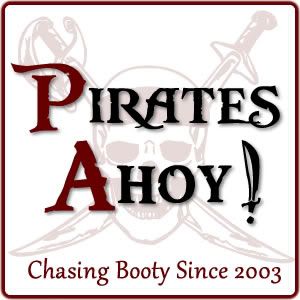
Perhaps the most important part of this is to make sure our community logo is properly used.
Here's a quick summary of logo use in each of the profiles:
- ModDB uses an outdated banner and a jolly roger
- Facebook doesn't use any logos at all
- Twitter uses a low-resolution square-shaped logo, and an outdated banner focused only on the Build Mod (which is not representative of all our mods)
- YouTube uses a tiny version of our forum logo on a black, square background

What I'd like to see is all profiles using the same logo, with derivatives of it for banners where necessary.
Trouble is, we need a high quality square-shaped logo for all four profiles, as our forum logo doesn't fit them well.
So, does anyone think they can come up with one, possibly using all or part of our forum logo? :checklist

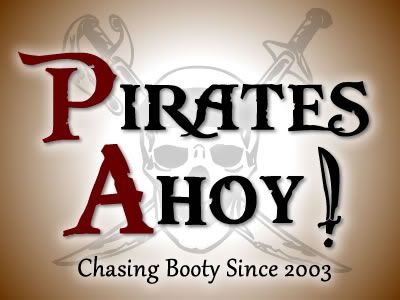
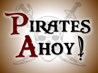
I've already had a go at improving the ModDB banner, which now resembles the forum's banner:
Original:
ModDB_PA_Banner_old.jpg

New:
ModDB_PA_Banner.jpg


What do you think? It has replaced the old banner for now, but can be improved on if need be.
I was considering using the 'P' and the 'A' from the forum logo to form a square logo, but I'd be interested to see what others can think of.
 
I think this is a great idea mate, you are absolutely right, we need a consistent look across all venues, with subtle differences of course. I really like the second one. I have tried a few times over the years to come up with something, but I am no graphics artist to be sure.

I wish I had a more detailed, hi res pic of the PA skull, but this is the best I have. Keith may have a better one buried somewhere though. :shrug


By the way, the font used in the PA logo is Pieces of Eight, and you can download for free from several places, like THIS ONE!
 
No comments, then...? Come on, ye scallywags! :aar

Here's a quick draft of my idea for a new square version of our logo:

PA_logo_small2.jpg


EDIT: And then Thagarr shows up just as I'm posting... xD
Thanks for the font info, I didn't know that. All I knew was that it looks suspiciously like the official POTC logo...

I like the old skull image too, but it's a shame it doesn't show the name very clearly.
 
I get distracted and sidetracked all the time. It's a very annoying trait. :rolleyes:

Anyway, another thing we should consider is rewriting our profile descriptions in some cases.
The ModDB one in particular only references the Build Mod, which is far from being our only project now!
I recently adjusted it to reword a couple of things and update the forum link, but it definitely needs improving:
The Pirates Ahoy! community has been working on the POTC Build Mod ever since the release of the Pirates of the Caribbean 2003 PC game. Build 13 has been released and Build 14 (AKA New Horizons) is being developed.

The community has changed drastically over the years, with members leaving and joining, but the goal remains the same: to make the Build Mod as good as it can possibly be. The community is free for all and everyone is welcome, even if you have no knowledge of modding whatsoever. We need game testers, coders, texturers, modelers, story writers, dialogue writers and people with good ideas. If you like pirates and want to help us in making a better pirate game, be sure to join!

All members are submitted to this group, provided that they are a member of the actual Pirates Ahoy! community. If you wish to be part of the team, join our forum at Piratesahoy.net .

The most recent one used by Twitter, Facebook and YouTube is good, but there's room for improvement if necessary:
PiratesAhoy! started in 2003 due to a complete lack of community management on Disney's behalf when they released their first Pirates of the Caribbean game. Since then we have gone on to a general pirate news site as well as creating our own mods for a number of released pirate themed games.
Any ideas for a better description for general use would be much appreciated (along with opinions on the logo above). :checklist
 
Well, since the current games are all about pirates, that fully pirate themed logo would seem to be the best, especially considering that the new game will not be all that pirate oriented. So a good separation might be in order.
 
Well, I don't think we should remove any pirate references, since it's sort of in the community name. :wp
It shouldn't matter that our new game isn't entirely pirate-oriented, because that will have its own unique logo.
 
I just checked the ModDB requirements for the small logo, and it has to be at least 300x200 pixels, so both the square logos above are too small. :facepalm
I can recreate a larger "PA!" logo using the Pieces of Eight font, but I'm not sure about the "Chasing booty since '03" line. Does anyone know which font that uses?
 
I think it is the same font, just in all small letters and smaller font size, I thought I had the original PSD somewhere, but I can't seem to find it. :modding

Here is one I was playing around with from a couple of years ago :

paforumlogo2.png
 
Good thinking Armada! I wholly support your efforts on this! :doff

Most of the stuff I just put in place because that's the best I had available at the time and didn't have enough time to make it REALLY pretty.
Will be good if we DO get that done. Better looks always help quite a bit! :onya

And indeed the PotC-only description does need to be changed; that was still from way back in the days.
 
I think it is the same font, just in all small letters and smaller font size, I thought I had the original PSD somewhere, but I can't seem to find it. :modding
It's not the same font; it's noticeably different, unfortunately. :shrug
Your banner looks nice, though again it's Build Mod specific.

Jaco: That looks very nice, mate! More original than my attempt. :onya
Something worth considering is how good the logo would look when displayed in a much smaller size on the profiles.
I reckon we'll need two logos:
1) Size 400x300 for ModDB (displayed about 1/3 of that size; see here). A wider version of your logo would be great.
2) Size 300x300 for Facebook, Twitter and YouTube (displayed in various sizes, down to about 88x88). Just the letters "PA!" might be best.
 
OK, here's a 400x300 coloured in version for ModDB.

PAlogo-400x300-001.jpg


To be honest, I think it looks better without the "chasing booty.." strapline, purely because the strapline has to be blown up so large to have a hope of being legible when the graphic is reduced to 1/3 on ModDB (if you can follow that weird logic!).

See what you think anyway.

PAlogo-400x300-002.jpg
 
That looks brilliant! I think you're right about the extra text; the image looks less cluttered without it, especially when displayed at a smaller size.
I've now set it as the ModDB logo, which you can see here. :doff

Do you think you could make a square version using just "PA!" for the other profiles? As I said, I think that would look better for the smaller display sizes they use.
 
Glad you like it.

Actually, that's only a rough .jpg. I was going to put up a better quality .png when the design was agreed. I'll do that anyway, and also a 300x300 PA! graphic. Should be able to do it in the next couple of days with any luck.
 
Well, your existing logo is far better than the generic jolly roger flag we had before, so it's worth using for now. I'll change it when you upload a final version.
Thanks for your efforts, by the way. :cheers


Does anyone have any thoughts on a better profile description than the ones mentioned above? This is just as important as the logo, as far as I'm concerned.
 
It's not the same font; it's noticeably different, unfortunately. :shrug
Your banner looks nice, though again it's Build Mod specific.

I am probably remembering wrong, I'll keep looking and see if I can find the original PSD. Yeah, that banner was just a test from a couple of years ago, just thought I would post it as a reference. I should have a better PA skull around too... somewhere! :wp
 
Jaco, that's some pretty good going you've got there! I like it! :woot

Agreed that the "Changing booty since 2003" text doesn't work on any logos that will be displayed in very small size.
 
BTW: I don't think that original PiratesAhoy! group profile description was mine at all, now that I look at it again. I never write "Pirates Ahoy!" with a space or "POTC" in all capitals.
 
I did say:
I recently adjusted it to reword a couple of things and update the forum link, but it definitely needs improving:
I usually write POTC as PotC as well, but I was just being lazy this time around. :p

More importantly, we have another inconsistency: "PiratesAhoy!" or "Pirates Ahoy!", which is correct?
I'm aware that you stylise it without the space, but our current forum logo clearly depicts it WITH a space, which is what prompted me to use it when I added the logo to ModDB.
 
Back
Top