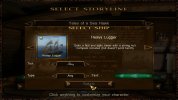
This looks like it will be a very popular addon. 
-
Visit our website www.piratehorizons.com to quickly find download links for the newest versions of our New Horizons mods Beyond New Horizons and Maelstrom New Horizons!-
Quick links for Beyond New Horizons
- Download latest version
- Wiki - FAQ - Report bugs here - Bug Tracker on Github -

Quick links for Maelstrom
- Download the latest version of Maelstrom
- Download the latest version of ERAS II - Download the latest version of New Horizons on Maelstrom
-

Quick links for PotC: New Horizons
- Download latest version
- Wiki - FAQ - Report bugs here
-

Thanks to YOUR votes, GOG.com now sells:
- Sea Dogs - Sea Dogs: Caribbean Tales
- Sea Dogs: City of Abandoned Ships
Vote now to add Pirates of the Caribbean to the list! -

Quick links for AoP2: Gentlemen of Fortune 2
- Downloads and info
- ModDB Profile
- Forums Archive -

A Pirate Podcast with Interviews
Music, Comedy and all things Pirate!
- Episode Guide - About - Subscribe -
- Twitter - Facebook - iTunes - Android -
- Youtube - Fill the Coffers -
You are using an out of date browser. It may not display this or other websites correctly.
You should upgrade or use an alternative browser.Solved Advanced Interface and Flags Code (and much more)
- Thread starter Armada
- Start date
I'm sure it will be. We lost that choice with Build 14, so it's great to bring it back. I only just noticed you can TYPE in the ship selection "Tier" box as well as use the Left/Right arrows.
Pretty cool, but if you fill in a blank, you can get to see some funny stuff like "prison ships" and crazier.
So does anyone think we need to keep that type box or is it enough to just have the arrow keys?And I figured out how to make those Pop-Up menu's BROWN:
With some trial-and-error, we can make it any colour we want. Does this look about rightThomas Colodel
Man At Arms
Very good Is that brown or black?Transparent black. That was the simplest to achieve. These are the relevant lines in RESOURCE\INI\NEW_INTERFACES\select_storyline.ini:Specifically those colour-related ones. The first number is related to the transparency and the other three are, I think, Red, Green and Blue.Code:
[DIALOG_WINDOW]
bNotUse            = 1
bAbsoluteRectangle    = 8
position        = 60,110,580,420
leftColor        = 255,255,255,255
topColor        = 225,0,0,0
rightColor        = 255,255,255,255
bottomColor        = 225,0,0,0

[TITLE_WINDOW]
bNotUse        = 1
command = deactivate,event:exitCancel
position    = 100,110,540,136
imageColor    = 125,255,60,10
I messed around with that "TITLE_WINDOW" quite a bit to make that background brownish instead of having to make it fully transparent.
However, [DIALOG_WINDOW] is still all black. I'd quite welcome someone to try and figure out some better colours. Indeed it DOES look very dark now.
Edit: Seems like editing topColor and bottomColor is enough. How is this for example?
It's even possible to make a colour progression, though I did not do that here.Anyone got any other comments on this interface? It is the first thing players will see when they get the new update; it had better work and look OK!! It is too dark and drab to suit me. I like bright colors and lots of contrast. Dunno what others think.Indeed I'm not the biggest fan of "dark" either. I reckon that does look better, Cassadar!
Did you do that as an edited image or by tweaking those code values to make it work in the game?
Strangely enough, there is no texture work required here; just editing those code files.
Annoyingly though, it seems the "natural" colour for that stuff is blue, so the RGB values don't work as you'd expect.
When I took a nice colour from Paint and filled in its RGB values in the code, it looked way wrong. If you wouldn't mind giving it a try. I do believe your artistic eye is more tuned than mine.
I've been looking at code too long; it's been years since I did proper modeling or texturing.
Edit: OH.... if you get round to trying this, note that you can update the interface WITHOUT closing and opening the game.
Just Alt+Tab out of the game to make the adjustments, then exit Select Storyline to the main menu and the next time you re-open the interface, it'll be the version you just changed.
Saves quite a lot of time when you find yourself trial-and-erroring around.
SankaDaVinci
Landlubber
Cant access the download page :/You mean from the opening post of this thread? That is old. See here instead: http://www.piratesahoy.net/threads/build-14-beta-3-progress.20686/God, this forum skin confuses me.
About the colours, that code seem to work quite strange sometimes. One time I changed only the transparency and suddenly the whole popup window was green; interesting.
Anyway, this
makes the popup interface look like this:Code:[DIALOG_WINDOW] topColor = 215,42,24,10 bottomColor = 215,42,24,10 [TITLE_WINDOW] imageColor = 120,46,28,12
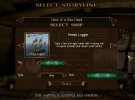
Similar at least, but not quite right.
Same here!God, this forum skin confuses me.

Indeed it works VERY strange. That's why I left it where I left it.About the colours, that code seem to work quite strange sometimes. One time I changed only the transparency and suddenly the whole popup window was green; interesting.
I'll take what I can!Similar at least, but not quite right.
The background of the title seems a bit too dark though; doesn't quite blend in with the brighter pop-up screen....
Yes, and I try to get something different at the moment, but it behaves quite similar. One time it was bright violet.The background of the title seems a bit too dark though; doesn't quite blend in with the brighter pop-up screen.... Well, at least we have no problems anymore to attract some Hippies (if there ever is the need). *cough*
That background texture shouldn't even be used; it's part of the stock game interface which was made transparent for the brown interface.The background of the title seems a bit too dark though; doesn't quite blend in with the brighter pop-up screen....


