That must have been it. Or?


Visit our website www.piratehorizons.com to quickly find download links for the newest versions of our New Horizons mods Beyond New Horizons and Maelstrom New Horizons!
Join our discord server for regular podcasts/AMA about upcoming and released pirate games (Caribbean Legend, Corsairs Legacy, Ahoy, ERAS 2, etc.):

Quick links for Beyond New Horizons
- Download latest version
- Wiki
- FAQ
- Report bugs here
- Bug Tracker on Github

Quick links for Maelstrom
- Download the latest version of Maelstrom
- Download the latest version of ERAS II
- Download the latest version of New Horizons on Maelstrom
![]()
Join PiratesAhoy! on our social channels:


Quick links for PotC: New Horizons
- Download latest version
- Wiki
- FAQ
- Report bugs here

Thanks to YOUR votes, GOG.com now sells:
- Sea Dogs
- Sea Dogs: Caribbean Tales
- Sea Dogs: City of Abandoned Ships
Vote now to add Pirates of the Caribbean to the list!
Quick links for AoP2: Gentlemen of Fortune 2
- Downloads and info
- ModDB Profile
- Forums Archive

A Pirate Podcast with Interviews
Music, Comedy and all things Pirate!
- Episode Guide - About - Subscribe -
- Twitter - Facebook - iTunes - Android -
- Youtube - Fill the Coffers -

...snip...


Did you have any good pictures of the green shemes? Or did i overlooked one in your post?
Did you have any good pictures of the green shemes? Or did i overlooked one in your post?
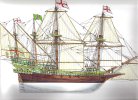
Nightwatcher, The eleventh picture in that set is the Revenge with the green paint scheme.
Looking great mate!
MK


this gunport seems crooked:
and i'm wondering if there's going to be some sort of door or ladder over here for access: