• New Horizons on Maelstrom
    Maelstrom New Horizons


    Visit our website www.piratehorizons.com to quickly find download links for the newest versions of our New Horizons mods Beyond New Horizons and Maelstrom New Horizons!

Released the one and fifty three

AH, My failure to see "would" as opposed to "wouldn't". I guess I was reading your post too fast. Apologies Morgan. :eek:ops :764:

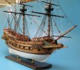
My comment was centered mainly on base coat rather than the decorative paint. The Tudor ships had very famboyant colorful schemes, so whose to say. Can't assume or apply generalizations to the whole I suppose. It's interesting how dramatically coloring changed in the first decades of the 17th century. By 1620, you rarely saw the colorful geometric paint schemes anymore. The base coat should be dark. That contrasts the colors even more.

I would bet that ships of the 1550's through 1610 timeframe often came back to England with very faded colors after a long journey/expedition. It would be neat to have a faded version.

One other thing I was thinking about that might favor the lighter door frame over the darker is that often when you walk around on the replicas, you really have to duck your head before you enter/exit thresholds. If it were dark (and it can get very dark at sea) I think I might appreciate a bright doorway so as not to knock my head into concusion. I will make it a point to research a few period models and see if I can observe what color their thresholds are.

MK
 
Personally, I think the orange/yellow door frame would match the rest of the color scheme better in game.
 
one thing i'm wondering about is if the doorposts would look better with green accents, while leaving the upper half red and yellow. it would look more similar to the paint scheme on the sides, though i suspect that combining 3 colors together on that thing might not work so well. also, though i like the look of the white frame, it might give that section of the bow too much white compared to the colorfullness of the sides. i do like the reasoning about having a lightly colored frame though.
 
Agreed on the doorposts. I also agree about too much white in the bow grating and frames. It wouldn't have stayed white long....after all that's where the crew went to void themselves. The splashing wake would've kept it somewhat clean, but the paint would've needed to have the traditional pitch and tar I talked about to keep from being worn off by urinal ammonia.

I know...yuck. There's a reason they call it "the head". Most of the prow/beakhead gratings I've seen on replicas have been black.

MK
 
Hi ho, dear pirate mates, a nice discussion you have stated here. Really good to read and with many good ideas to consider so far.

What we have so far:
1. less use of white, especially on the bow.
2. incorporate green to the doorposts.
3. give her a worn look. Less saturation, variation in the brightness of the colors, darker colors.
4. remove the red from the gunhatches as it became popular much later.
5. dark gratings in the head.
There i did have some work, it seems. :will

Whats about (dark)blue to paint the white areas?

... meanwhile in the yard, I managed to run out the pieces, at least on the gundeck and to finish the balcony. The greenish of the cannons has to be cut down or better blacken them. They got the stock paint so far.
and now the first pics from the stern:


4. remove the red from the gunhatches as it became popular much later.

I don't remember talking about this.

Nearly every Wheatley and Landstrom illustration I have shows red inner gunwales and hatches during this period. These were fairly good authorities on historical sailing ships. Also most models I've seen also shows them red. Is there a good source that refutes this?

Several of my sources and a couple of models show yellow door thresholds.


http://www.modelshipmaster.com/products/tall_ships/hms_revenge.htm

MK
 

Attachments

  • Revengecomplete10.jpg
    Revengecomplete10.jpg
    77.7 KB · Views: 185
  • Revenge_1.jpg
    Revenge_1.jpg
    46.4 KB · Views: 149
the lighting makes it a bit hard for me to see. you seem to have gotten the planking pattern right though. balcony looks pretty good to me, for as far as i can see.

judging by the historical commentary, i'd imagine that most of the bow could actually stay white. it's just those crossbeams in between the sidewalls of the bow that need blackening. what exactly did you change on the bow's colors?
 
4. remove the red from the gunhatches as it became popular much later.

I don't remember talking about this.

Nearly every Wheatley and Landstrom illustration I have shows red inner gunwales and hatches during this period. These were fairly good authorities on historical sailing ships. Also most models I've seen also shows them red. Is there a good source that refutes this?

Several of my sources and a couple of models show yellow door thresholds.


http://www.modelshipmaster.com/products/tall_ships/hms_revenge.htm

MK

I have read your post in the other threat and was under the impression that that was the case. Also I didnt slept much that night and was very tired, sleepy. So we cut P4!
I changed the colors to match this model of you better.
the yellow doorway looks good to me in that theme.


the lighting makes it a bit hard for me to see. you seem to have gotten the planking pattern right though. balcony looks pretty good to me, for as far as i can see.

judging by the historical commentary, i'd imagine that most of the bow could actually stay white. it's just those crossbeams in between the sidewalls of the bow that need blackening. what exactly did you change on the bow's colors?

The pattern was'nt changed by me so far. I only unhided and textured the balcony.I look at them later when i work on the captains cabin and the glass part there. Please have a look for the changes.

Applied the altered color theme:


played in PS to achieve a weathering effect on the textures:


yeah. that's looking pretty good. doorway's way too yellow though, artistically speaking. it stands out a bit too much for me, but considering what's been said, that is of course intentional.
 
Looks FANTASTIC!!!

Hey one other thing I would ask is that when you model the back balcony, that you leave off the E and R. Those character's stand for Elizabeth Regina, and identify the ship as a Queen's ship. Elizabeth died in 1603. It was not totally unusual for a wooden ship that was taken care of really well to last 80 years or even a century. There are a few scant references of Hanseatic and Portuguese carracks built in the late 14 hundreds, that were still in use by the early 16 hundreds. Since the era of our games is primarily the mid/late 17th century, I think it would be best to leave off the "E R". Obviously your call though. Just a suggestion.

MK
 
Ok, I toned the yellow down and adjusted some textures further. Thinking that i like the outcome. Your say?


The "E R" matter is a good question. We could include it in one texture and leave it of in the other two. Ok?

Ähm Craiggo, you are more an texture artist then me, right? I'am in need of an texture layer that strengthens the weatherly look and is'nt repetitive. Does you or everyone else has tips to archive this in PS?

Wow HundertzehnGustav thats almost poetry you put in the words. :bow
 
Nightwatcher, the artist is you, not me.

less white, more green is good. i like green. color of strength and peace, to me at least. :b:
the whole paint job will give her a very dynamic impression, in that , creating it and maintaining the colors is a lot of detail work, therefor the sailors particularly good workers, and not flimsy sissies.
At a time where there were no sculptures and no gold applications - paint, it seems, was the only way of "dress to impress" the Navies had.
Revenge so far is doing a good job. She is, to my eyes not elegant - no galleon ever was... but she impresses.

am looking forward to the main and rear Decks after the front sections seems almost done.

Stupid question:
If i were her Leader, and seeing that door so close to the bow, concerned of water intake, and protecting my men in a storm... (wind and weather...)
Can that door be closed with a door? even if it is later configured as a "ghost" door the player can walk through, or a door modeled in an "open" position.
:ty
 
lol... was writing and correcting the last post for about 15 minutes, and there you come with just what i wanted to see.
:shrug
:woot
lets see...
Can the inferior Deck Gunports be given a few feet more depth somehow? in a way, that instead of having a flat panel, the volume could be represented by a 3D cone, or Pyramid, large at the gunport, and getting smaller inside of the ship. The polygons could converge in the position where the powderpack and the cannonball are inside the barrel.
That gives a better sense of depth, but still avoids the modeling of the entire interior.
worth a try? :shrug
 
i think you're not seeing the walls properly because of the shading. they do have actual thickness. you can see it on the ports at the left of the picture. i do think though that the planking looks a bit odd on the inside of the wall. it's realistically done on the outide, but the inside is a bit unrealistic. you've created the illusion of a bit more structure on the outside than you've done for the inside, in the sense of vertical beams.
 
Yep all doors will get there doors, if appropriate in open position (when we have a room behind to wander.

The cannon models arent finished yet. I have to model there ropes and some more details. The gundeck hatches are easy to modify. and 6 more tris each is'nt to much. Will incorporate the pyramids. BTW as iam now at 23tsd tris and have an idea of how much tris i would have to spend for the other parts, I am relatively sure that your idea with the walkable balcony is in.

But I have to disagree totally in the matter of elegance! :ixi
There is no shiptype to my knowing, which has a nicer flow of lines and curves. They almost seem to say: "Touch me, stroke me"...
but, hey, thats just me and my bad brain. :rolleyes:
 
i would say the xebec is more graceful (which would be the historical one. not the ugly stock ship buggers), but the galleon has that and a certain brawn about it which i like.
 
Back
Top